Welcome to the first of my bi-weekly Curious Business reviews.
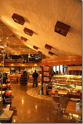
The Urban Fare concept was developed in the late 1990s and brought to foundation in August 1999 as part of the overweitea food Group. Now with three stores in Vancouver they have become a hotspot for regular urban dwellers and tourists alike. The design of the store is beautiful with dazzling product placement and color coordination - nothing is left to chance. I wanted to learn more about Urban Fare so I grabbed my camera and book and went to Urban Fares busiest location to interview assistant manager Nat Dosanjh. A man who has spent over 17 years in the Consumer Staples industry
Urban Fare has taken a generally common concept – the fresh deli - and have turned it into a fully functioning restaurant. But not just that, Urban Fare has chefs coming to their store asking for all sorts of specialty items, which is why they implemented their Guest Services division. “If a customer needs it, they’ll get it”. So readers - if your looking for an $800 can of caviar you can find it here.
The restaurant has it’s own entrance and big windows exposing it to the street, utilizing the natural sunlight. I almost forgot I was in a grocery store because the placement of the restaurant separates the diners from the shoppers, yet still allows the Grocery store to integrate products into the restaurant. The products inside and bordering the restaurant have discrete price’s (sometimes none), and are commonly used as art, allowing customers to eat comfortably without being force-fed advertisements and deals for new products.
Some reasons I love the fully functioning restaurant idea.
1) They are building consumer loyalty through two separate venues.
2) It creates the opportunity to advertise indirectly, through subtle changes in scenery and product placement, and is exactly what they are doing.
3) It gives them the option to promote new product, by creating dishes featuring a new cheese, bread, meat, the options are endless.
“People come here to have an experience” And as you’ll notice the giant cement column is covered in product, and hid extremely well, instead of looking at a column we are looking at a type of store art. The simple signs are smart and effective.
As I said before, nothing in the store is left to chance. Instead of having a plain white ceiling, they’ve turned it into art. Each one of those wood boxes holds a product that they sell.
Pellegrino is used as art in the bottom left. The big wood shelves are faced with product, products that are chosen for their accenting colors. The beauty is, they are never giving the consumer the impression that they are being fed advertisements because the products are just a part of the bigger design picture. And if a customer has any questions about the product they can be sure to find a store employee close by.
If you run a small business, or just visiting the downtown core I suggest you stop by Urban Fare and check out the wonderful design. There is a-lot to be learned, from product placement, using product as art, being discrete, and combining two accenting concepts (grocery store and restaurant) to create a very genuine experience. The store is beautiful and has become a kind of Vancouver landmark for locals and tourists wanting to see a new breed of grocery store.


0 comments:
Post a Comment